A better experience starts with removing friction. This redesign focuses on clarity, simplicity, and ease of use.
-
Led the redesign of an ecommerce dancewear website, modernising layout and typography to create a more engaging, intuitive shopping experience. I achieved through a new promotional homepage, simplified navigation, improved filtering, and clearer product pages with enhanced CTAs and feature highlights.
-
High-fidelity designs, wireframes, and interactive prototypes in Figma, alongside Dev Mode specifications to support a smooth handover to development.
-
Move Dance - 2025
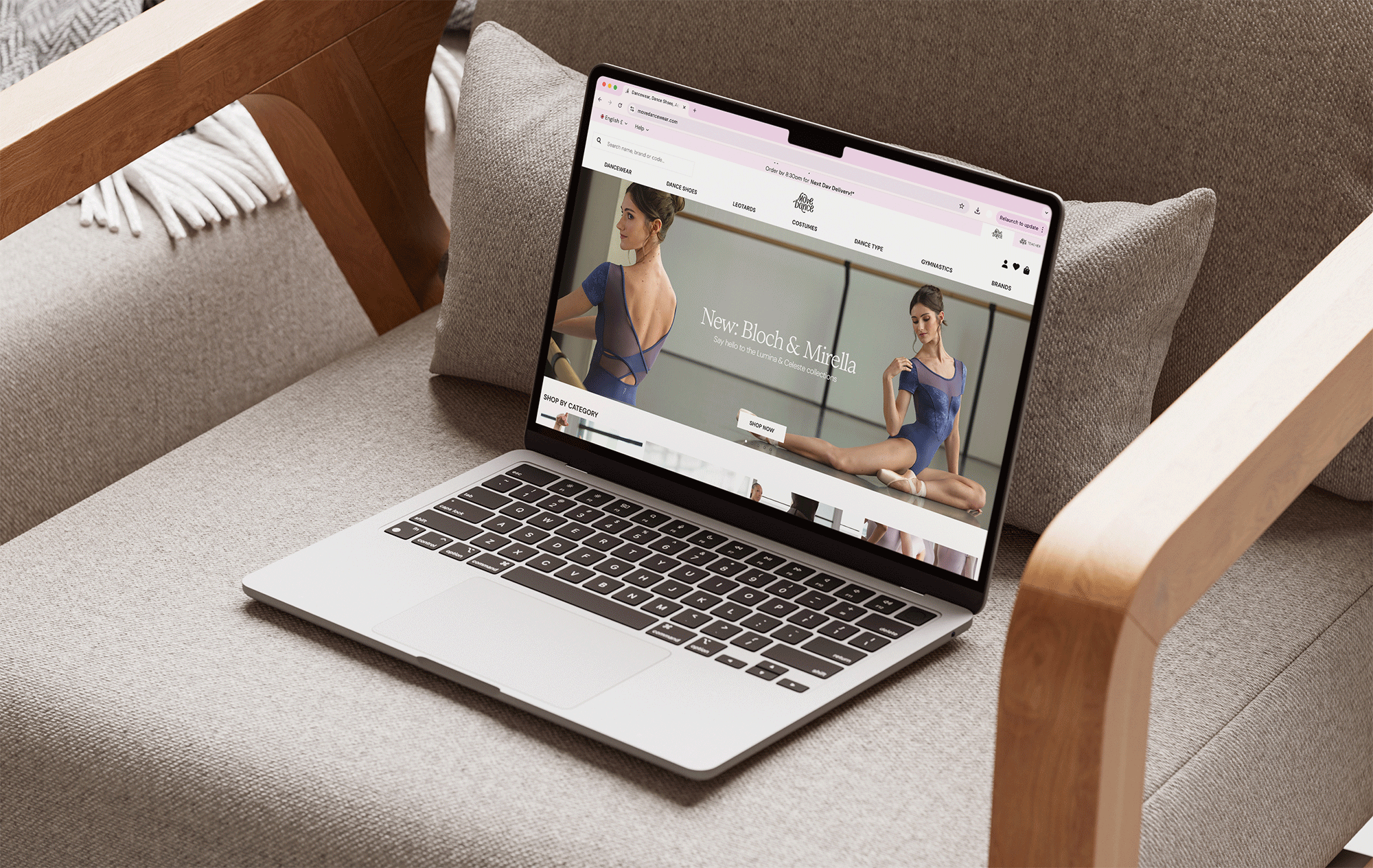
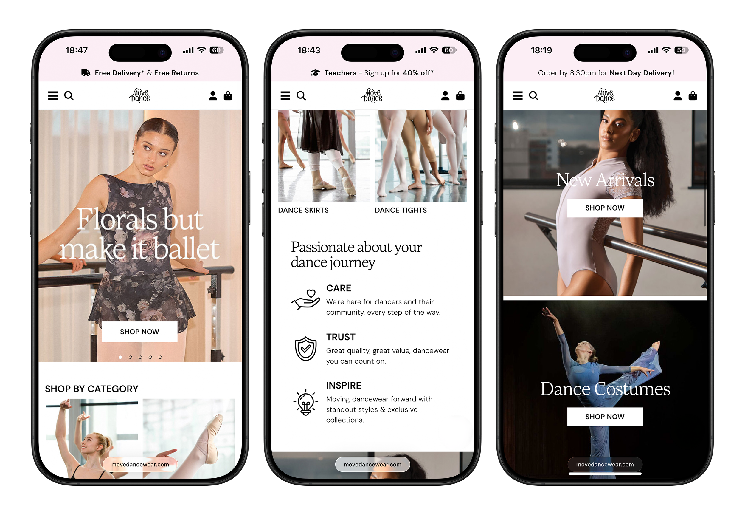
Homepage & Navigation
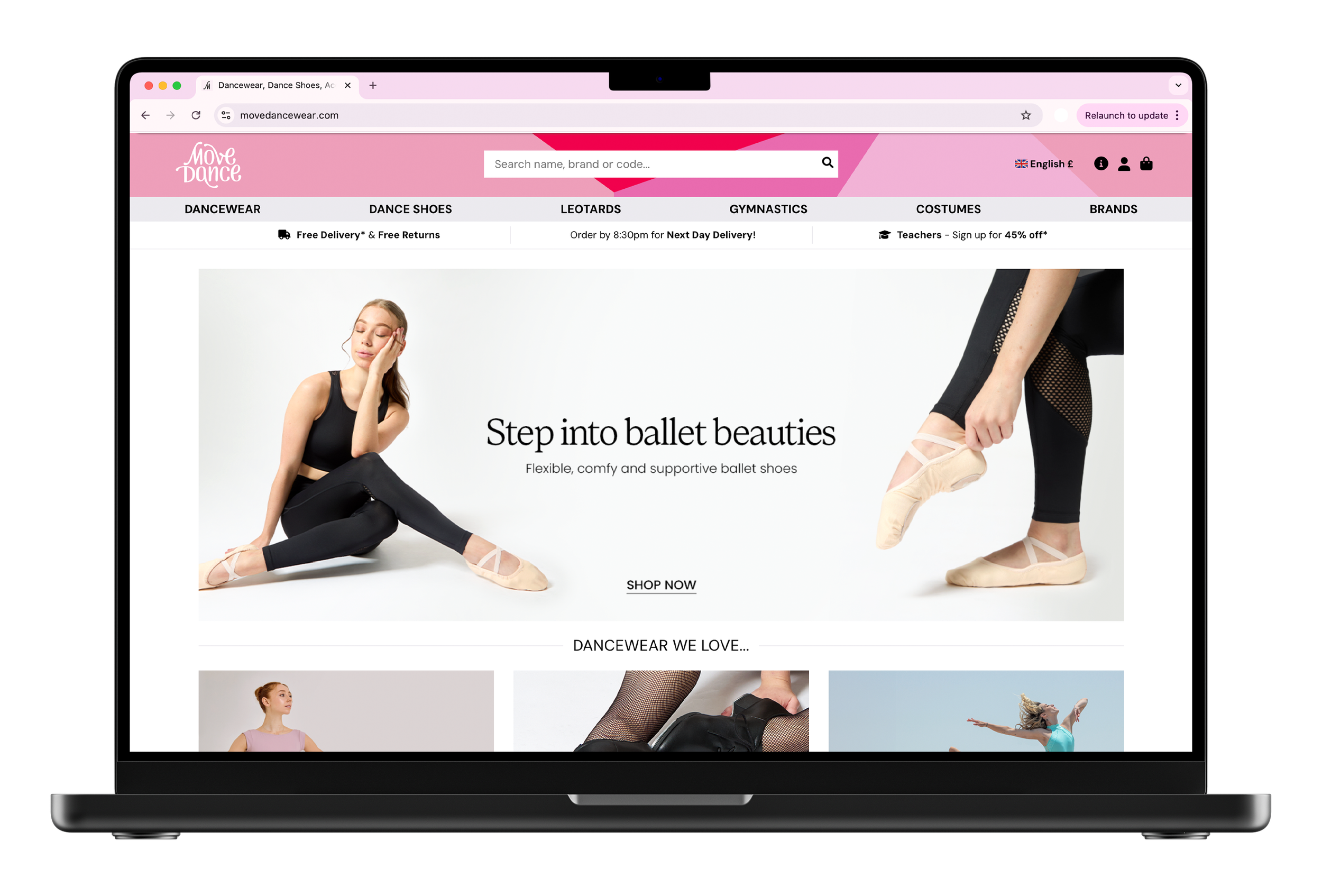
Outdated geometric header and navigation, static bordered imagery, limited banner functionality, and a lack of dynamic CTAs, resulting in a dated layout and typography.
Before
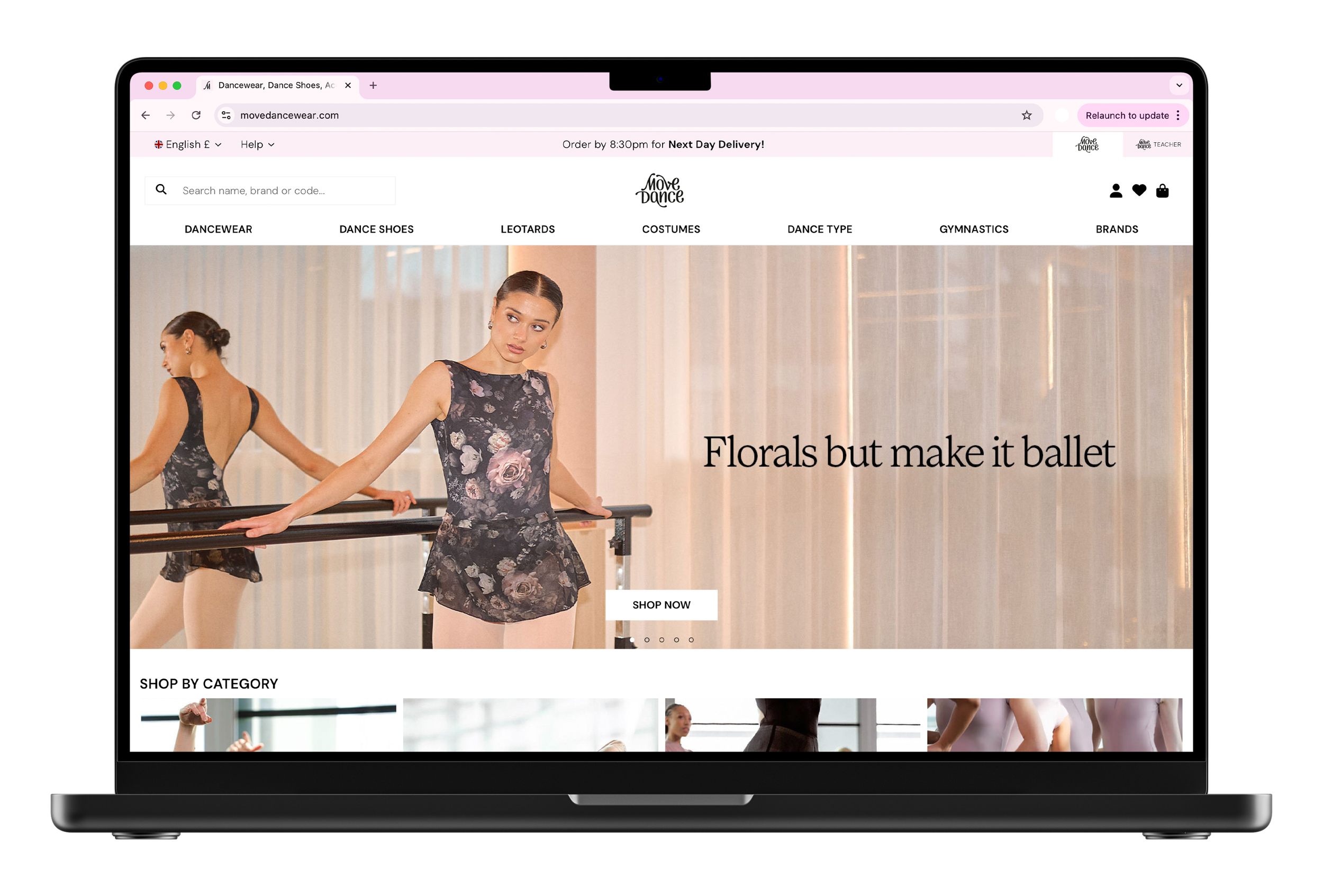
Clean, minimal header and navigation design, full-width immersive imagery, multiple carousel banners, refreshed layout and typography, dynamic interactive CTA's, and redesigned carousels featuring categories and product highlights.
After
Category Page
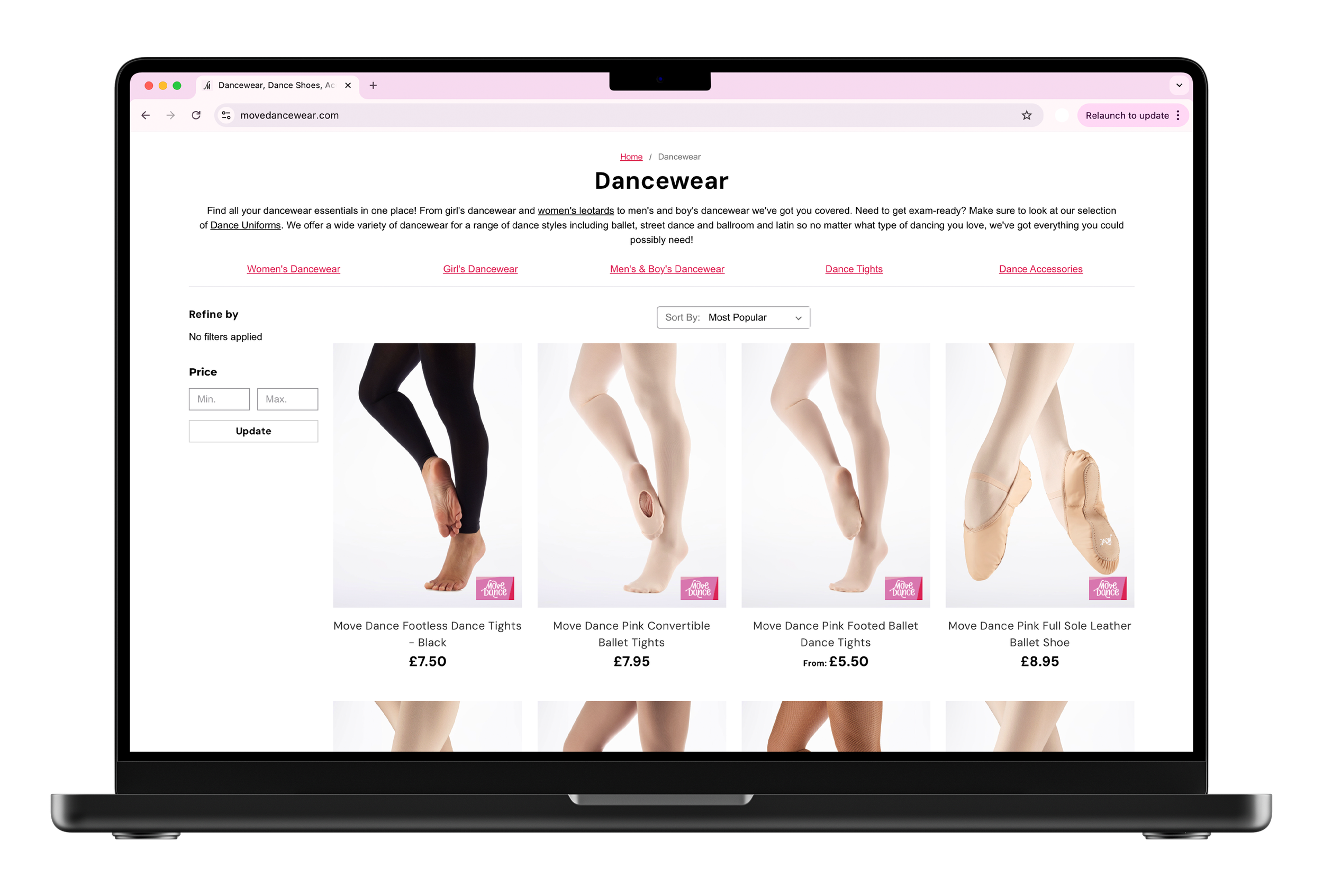
Heavy, misaligned text that didn’t reflect brand guidelines, sidebar filters requiring excessive scrolling, and an outdated overall layout.
Before
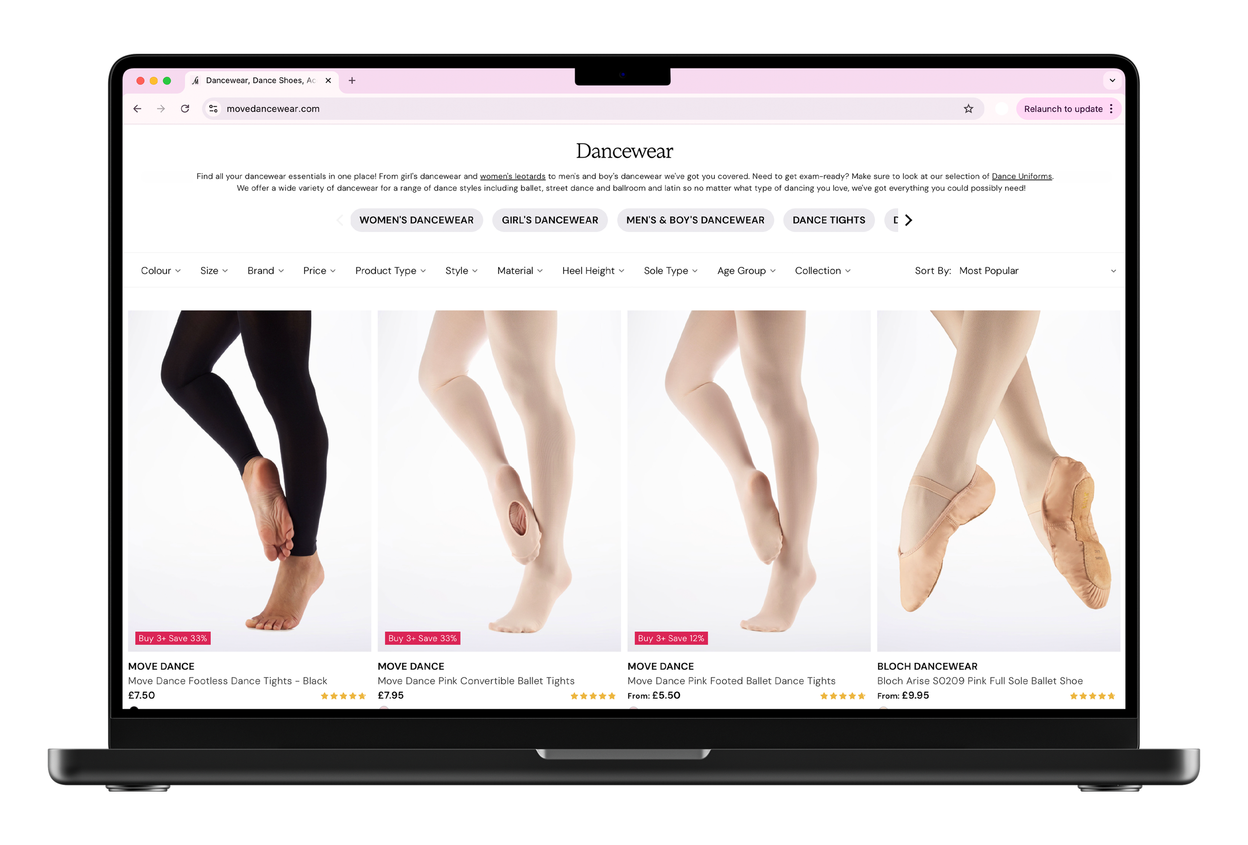
Typography updated to align with brand guidelines, a new top-of-page category carousel, filters repositioned for easy access, and reduced spacing between products for a more streamlined layout.
After
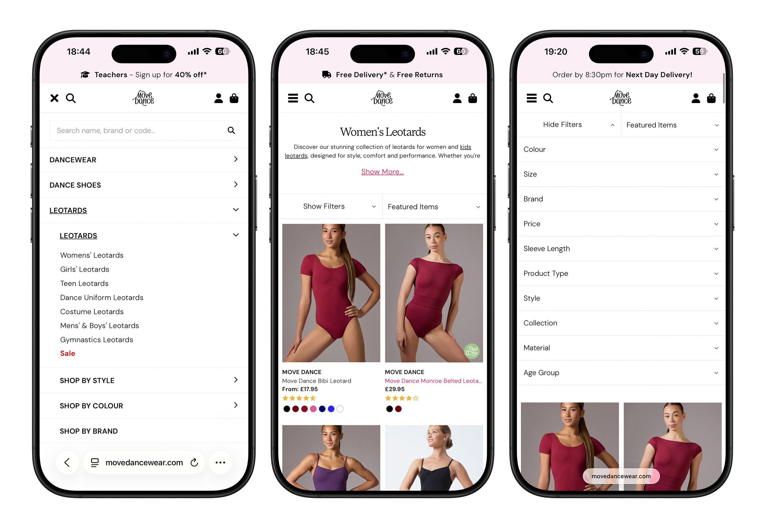
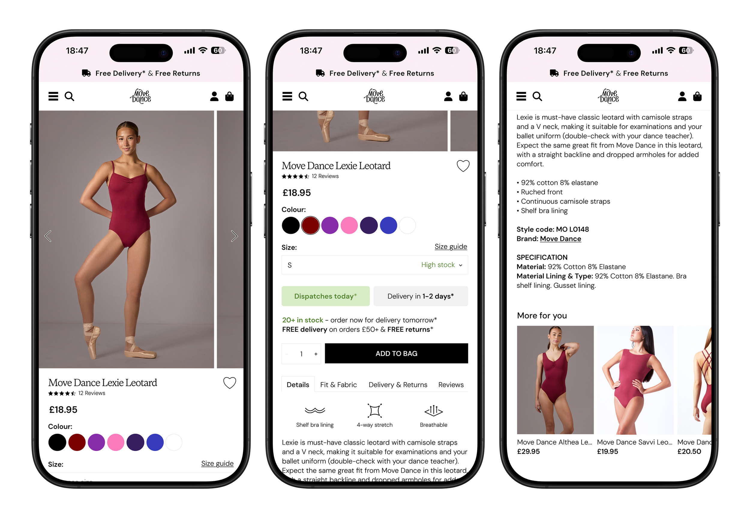
Product Page
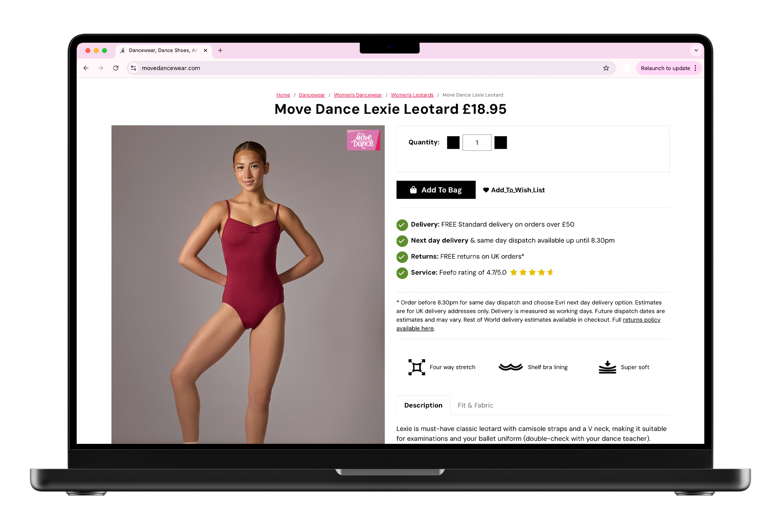
Oversized typography inconsistent with brand guidelines, extraneous information occupying valuable space, outdated CTA buttons, and an overall cluttered and dated design.
Before
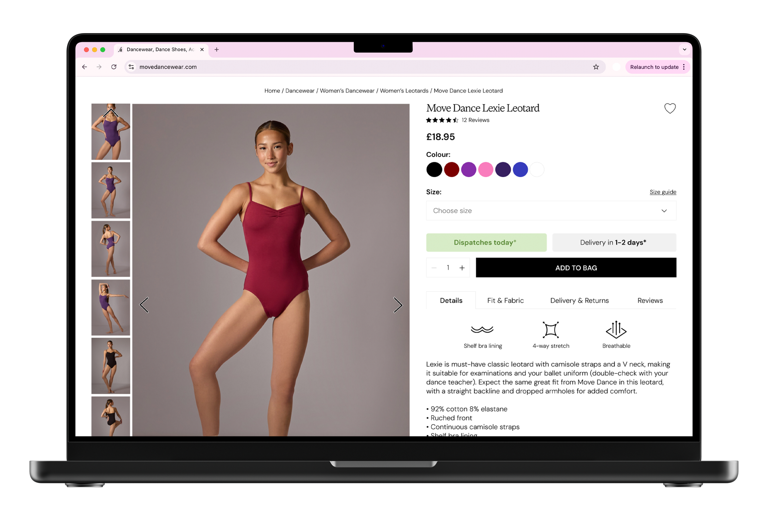
Clean, minimal design with on-brand typography, compact and user-friendly size and colour selectors, concise and easy to read delivery information, standardised product feature sections, and structured information presented in a table format. Updates currently in development.
After